The Glue
Agency between work and talent
I developed The Glue's logo, typography, and corporate identity for their talent agency based in Rotterdam. The Glue serves as a vital link between work opportunities and talent, providing guidance from school to employment.
The Glue, Rotterdam
- Corien van Rijn & Marieke Van der Weiden
- Filed: Logo, Identity, Type
- Year: 2014
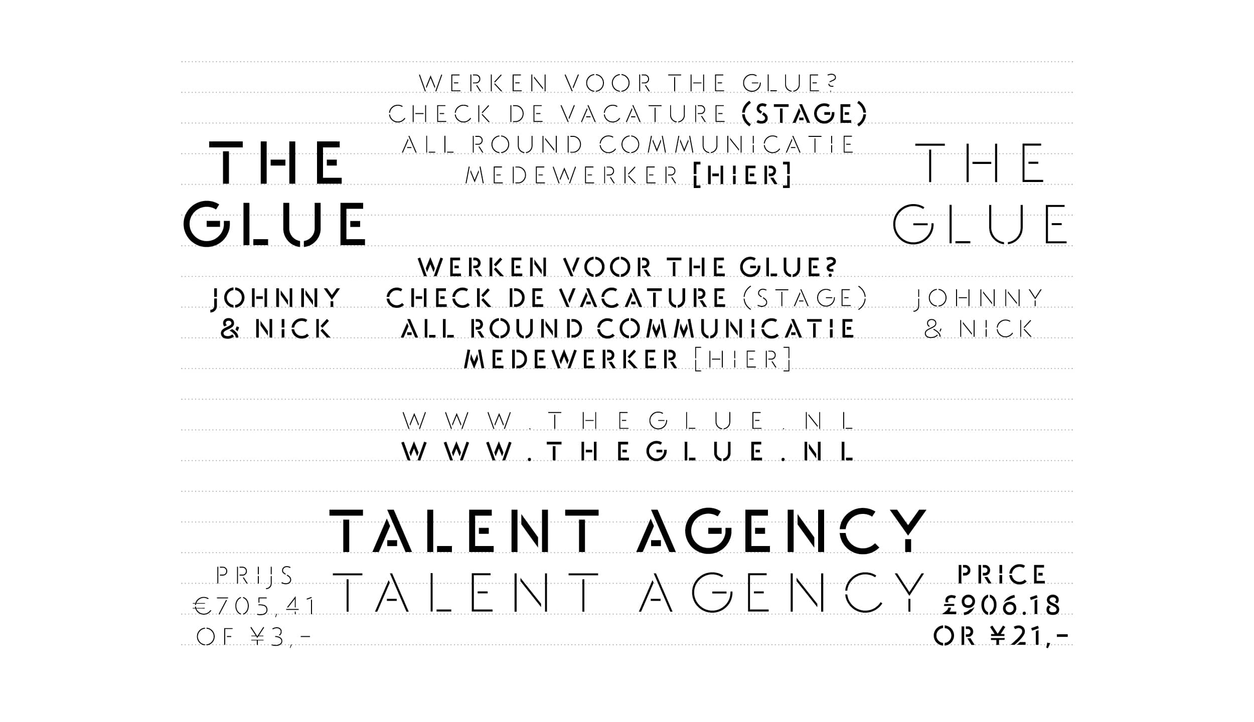
Logo and usage
The Glue logo is designed in two parts, allowing for unique versatility. The top and bottom portions of each letter can be moved independently, making it an adaptable identity that can frame information or images. The Glue's logo is created for diverse applications, including rotation, ensuring flexibility and creativity in its usage.
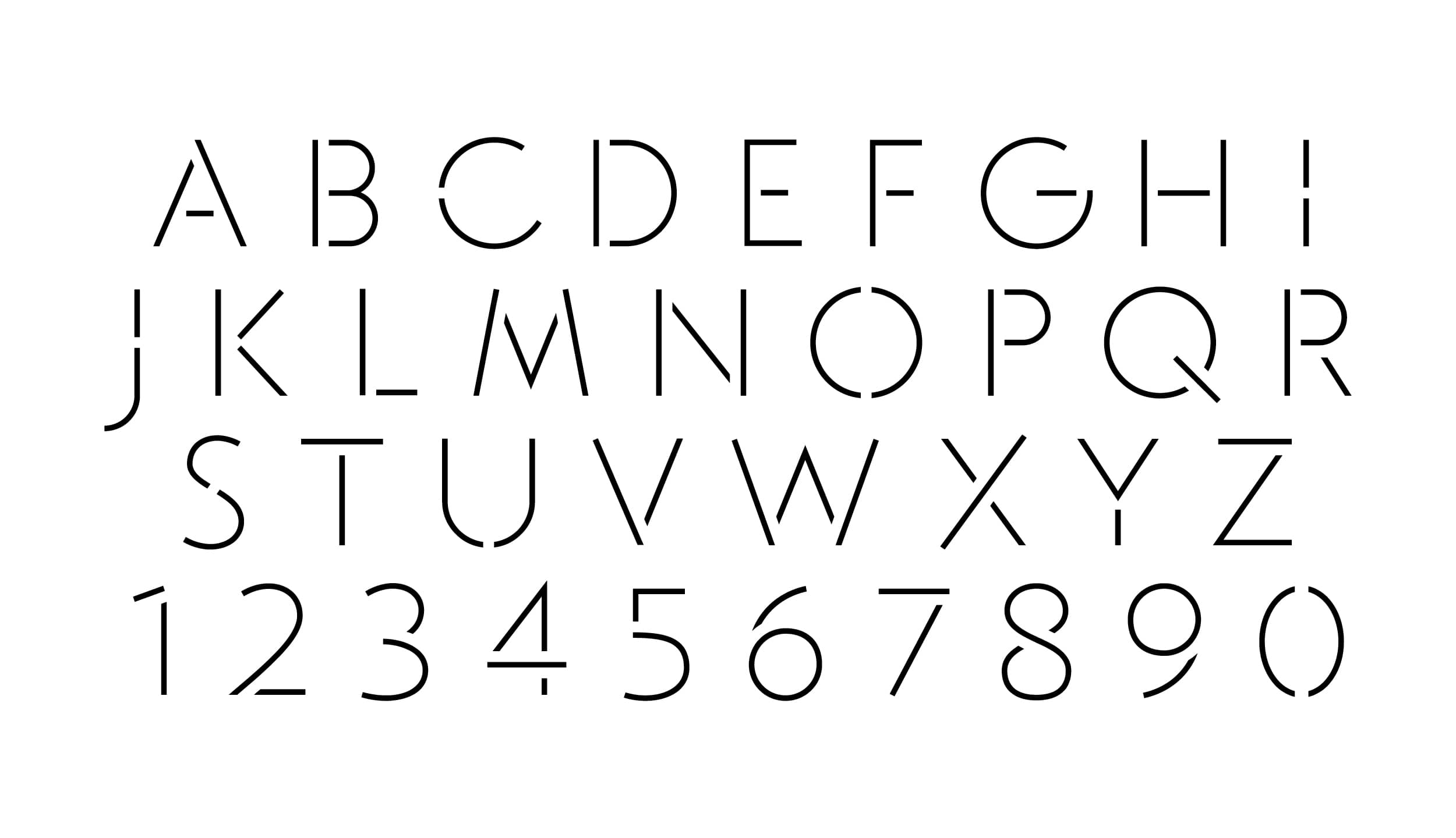


Typography and Icons
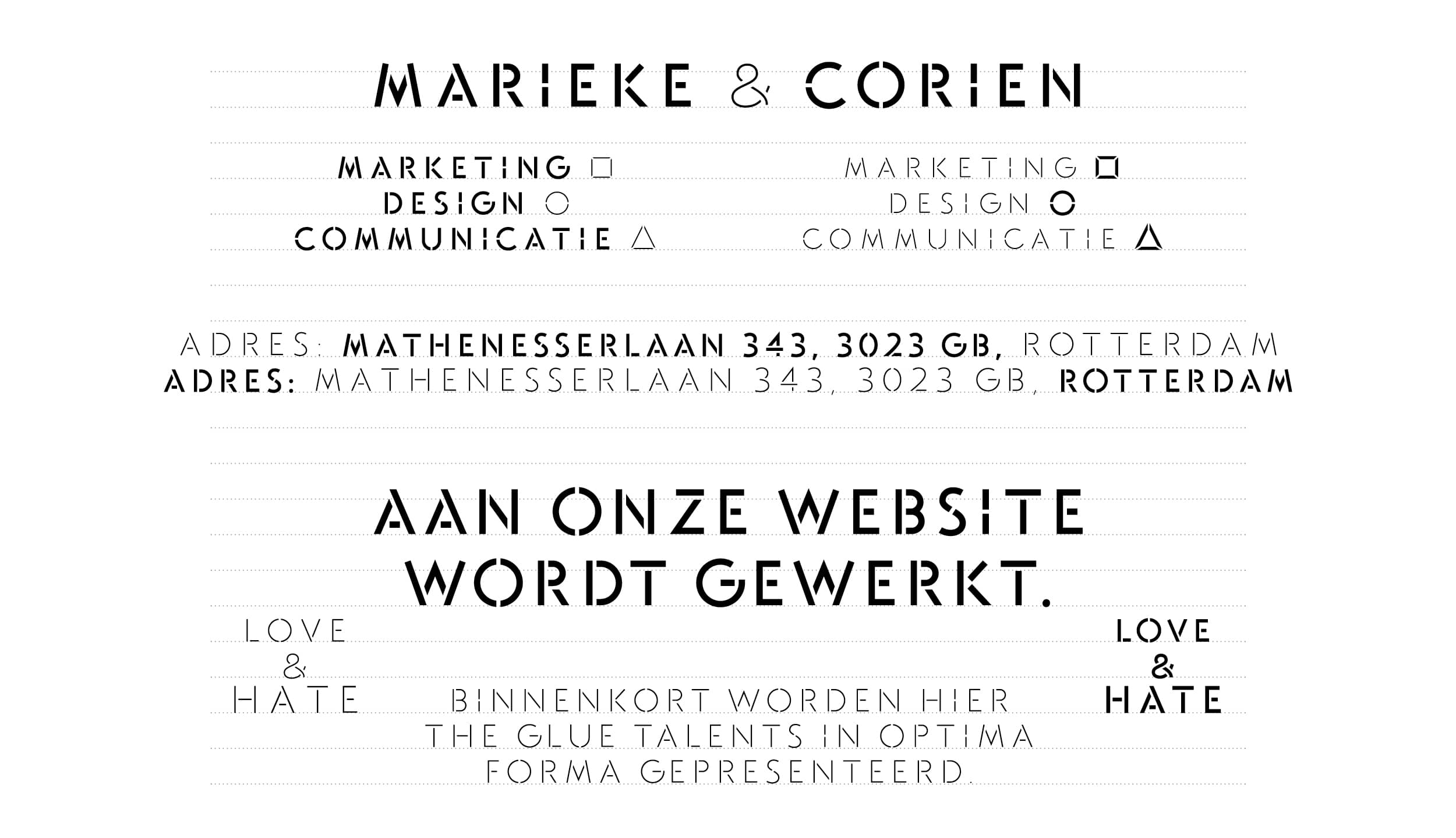
Accompanying this unique logo is a custom typeface available in both regular and bold weights, each complemented by distinctive icons.
Marketing (Square Icon) As a marketer, you learn to frame your surroundings to enhance the sales of products or services.
Communication (Triangle Icon) As a communicator, you connect and play a central role in engaging with multiple third parties simultaneously.
Design (Circle Icon) As a creative, you embrace boundless experimentation to bring forth new insights, techniques, and ideas.
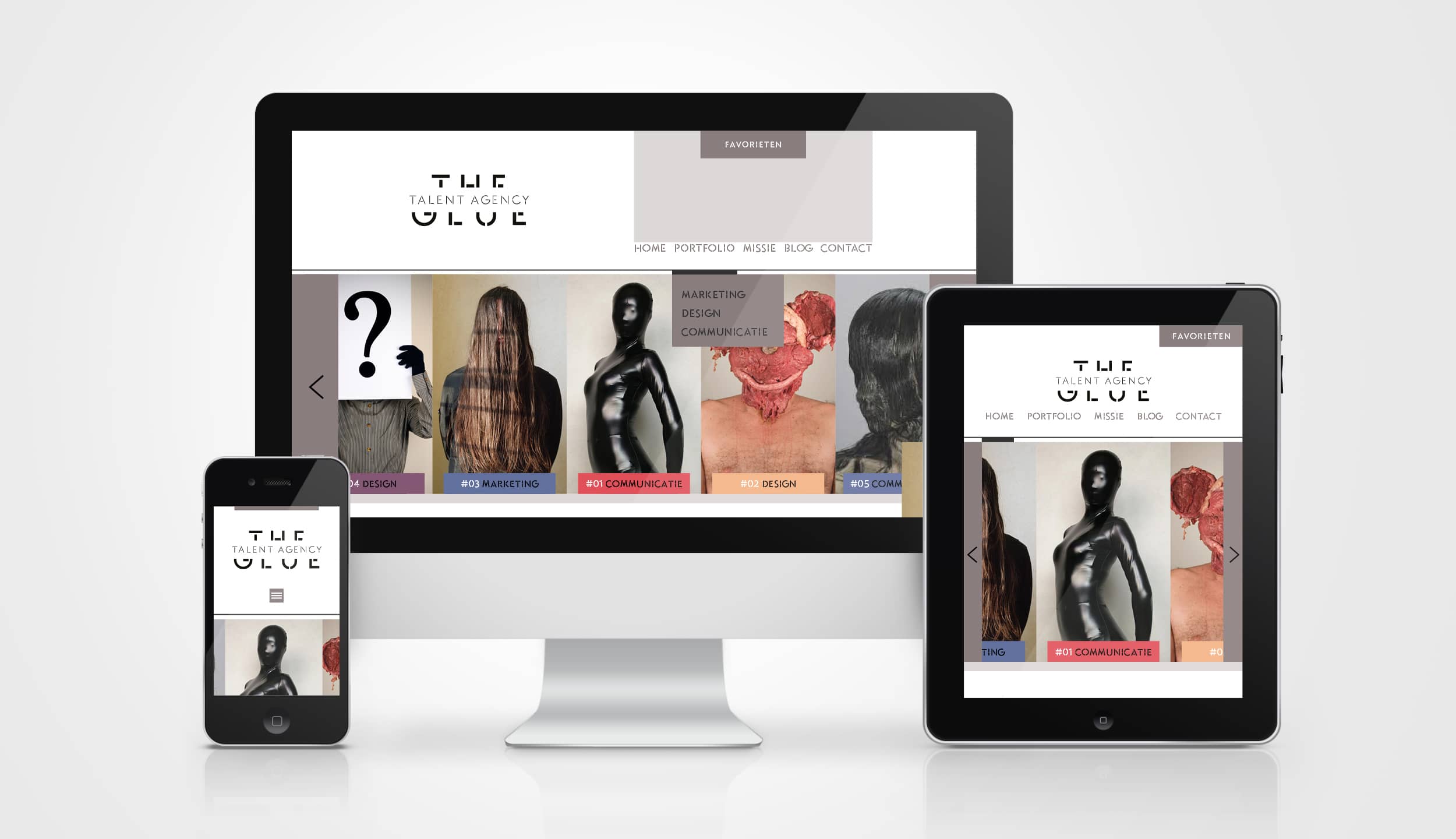


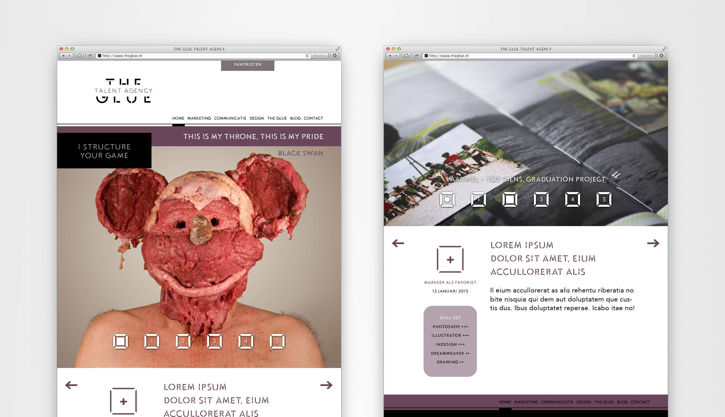
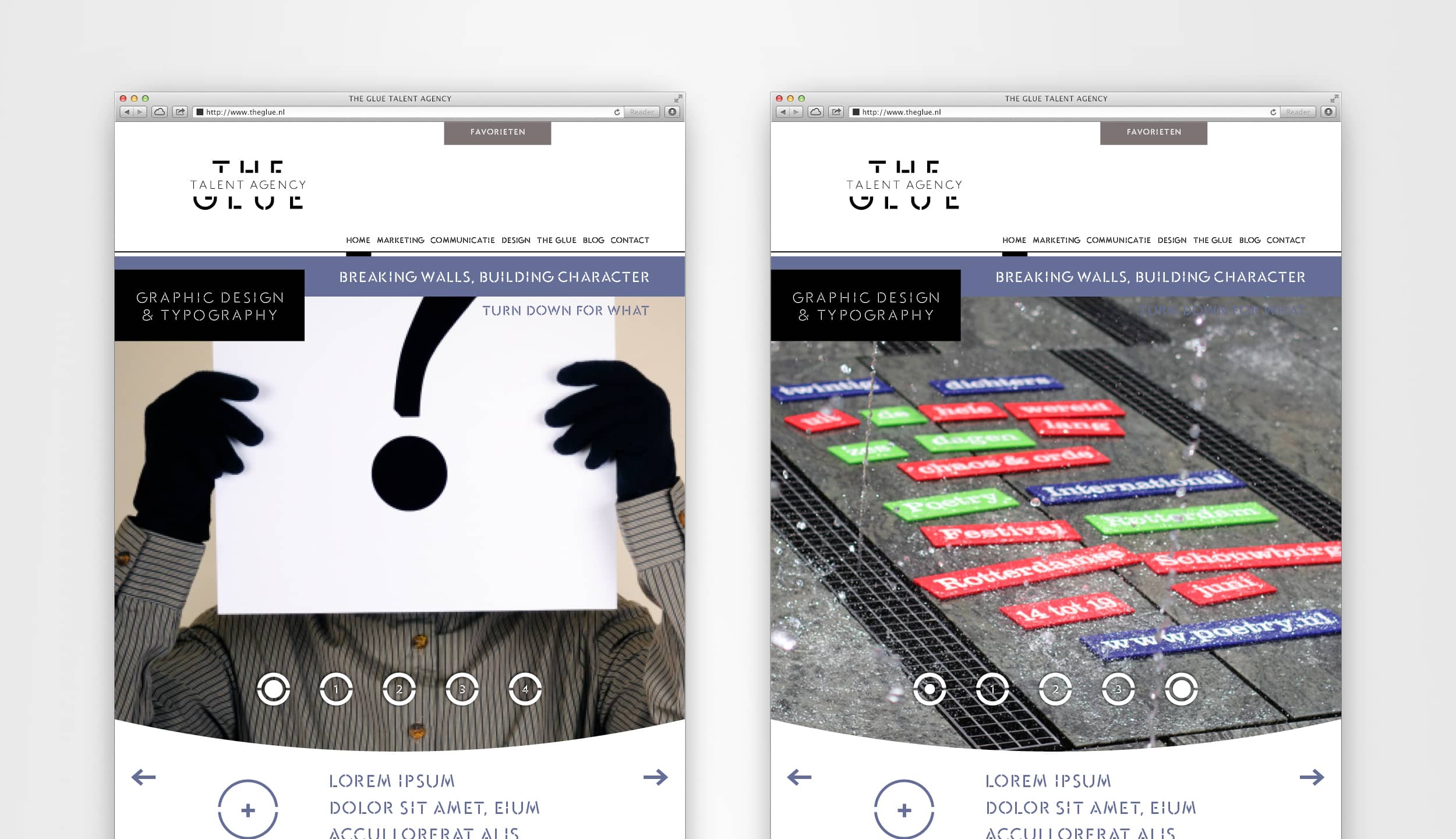
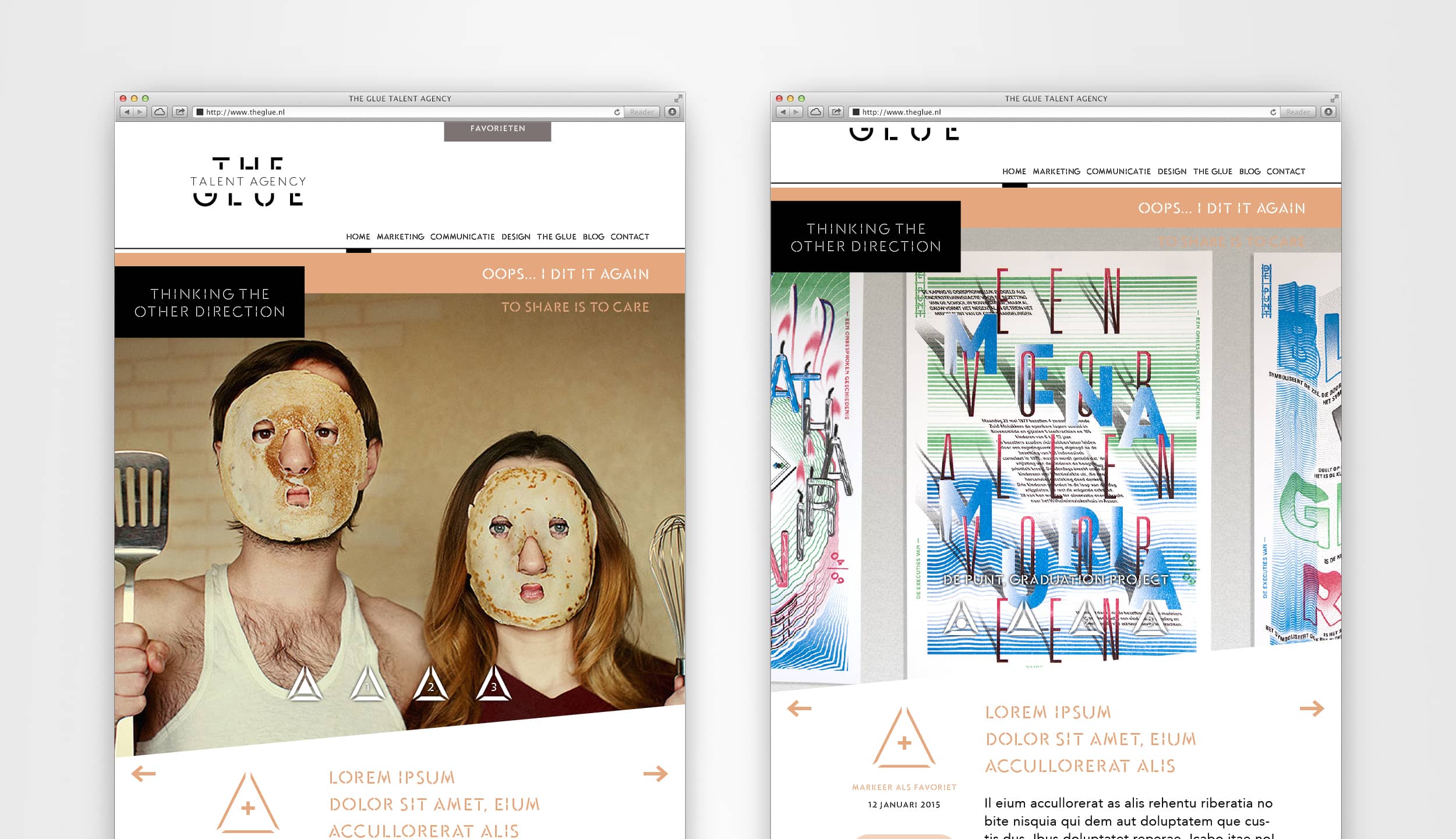
Website and page examples.
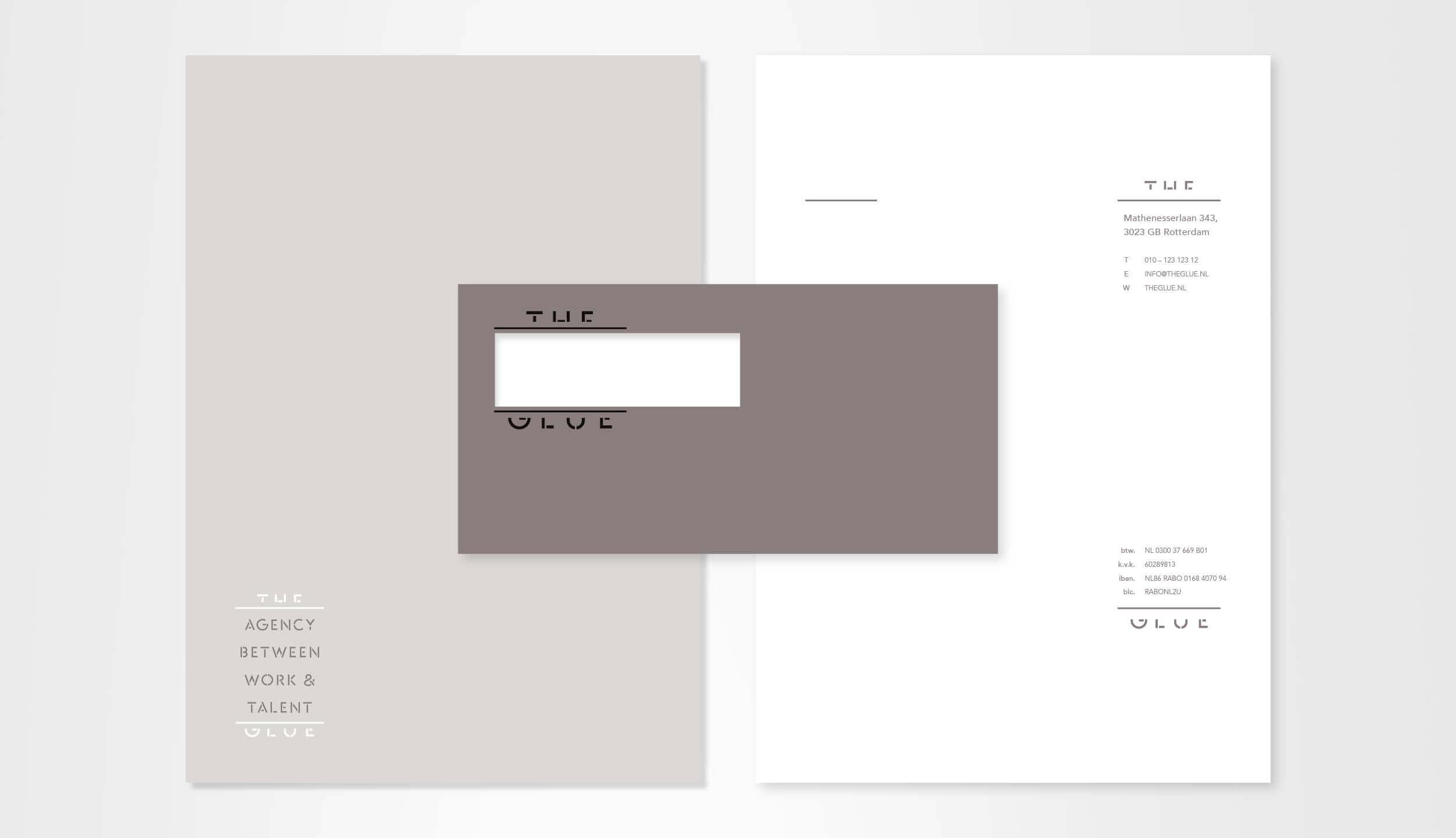


Corporate identity in print examples.