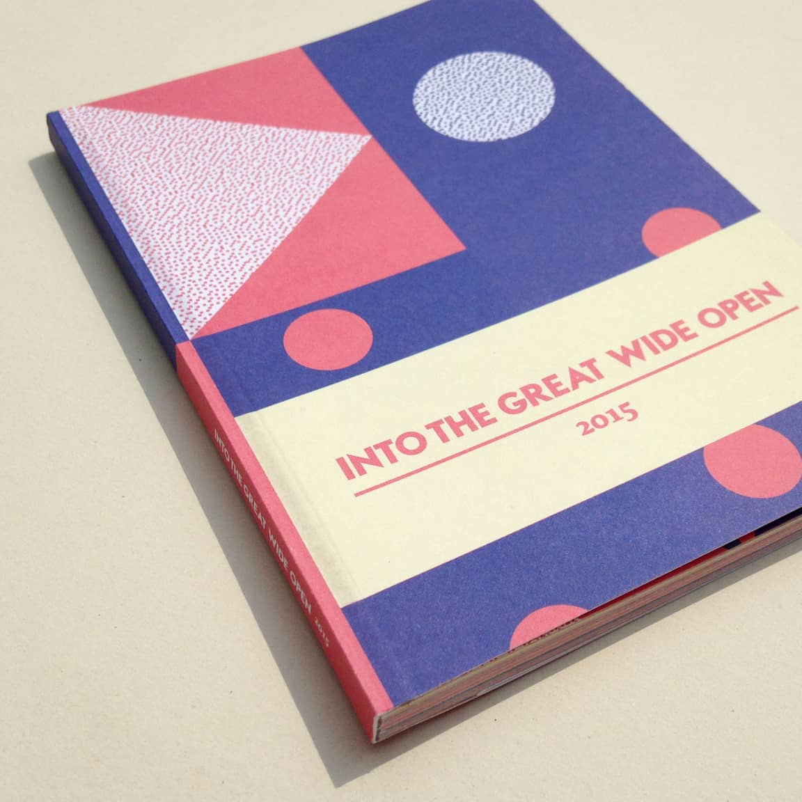
Into the great wide open
The road to a circular festival
For Into The Great Wide Open festival, I drew inspiration from the maritime signal flag alphabet to create its unique brand identity. I started by designing a new signal flag alphabet and used it as the basis for patterns on flags, merchandise, tokens, festival wristbands, fencing, stages, and other festival elements.
Into the great wide open
- Collaboration: Jimme Bakker
- Filed: Artist in residence, Identity, Merch
- Year: 2015

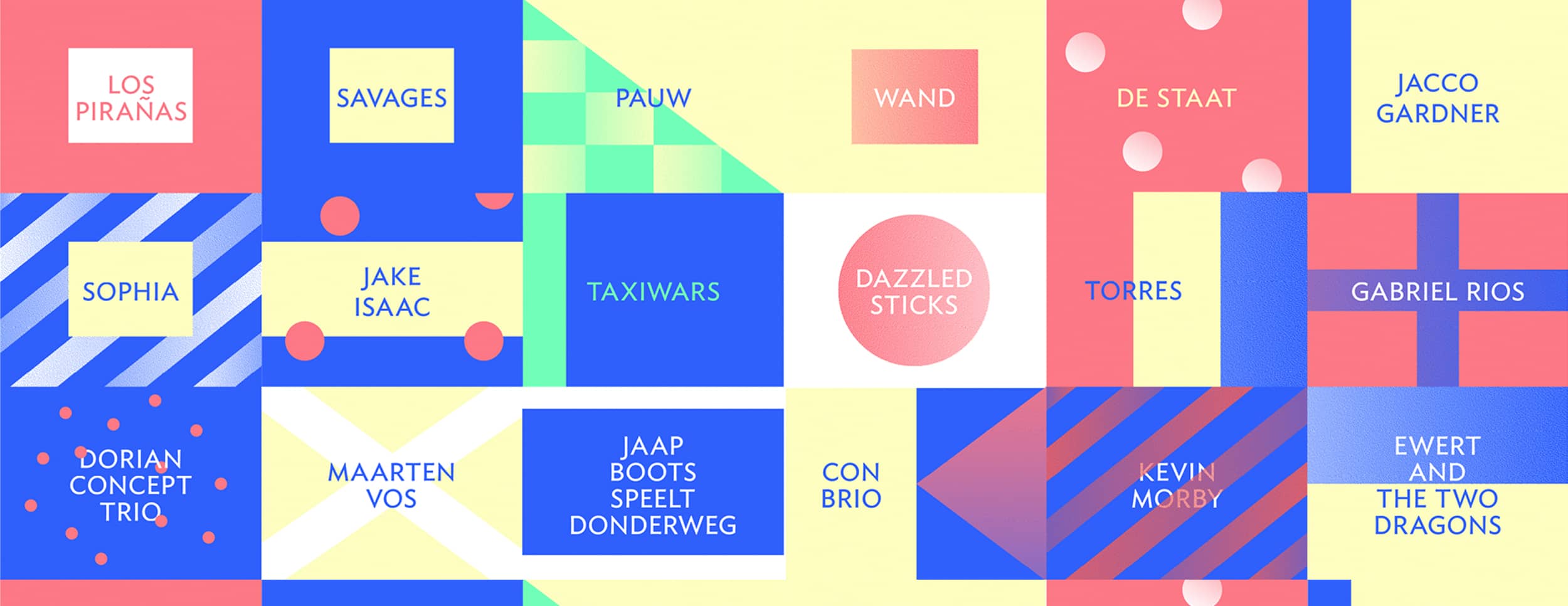
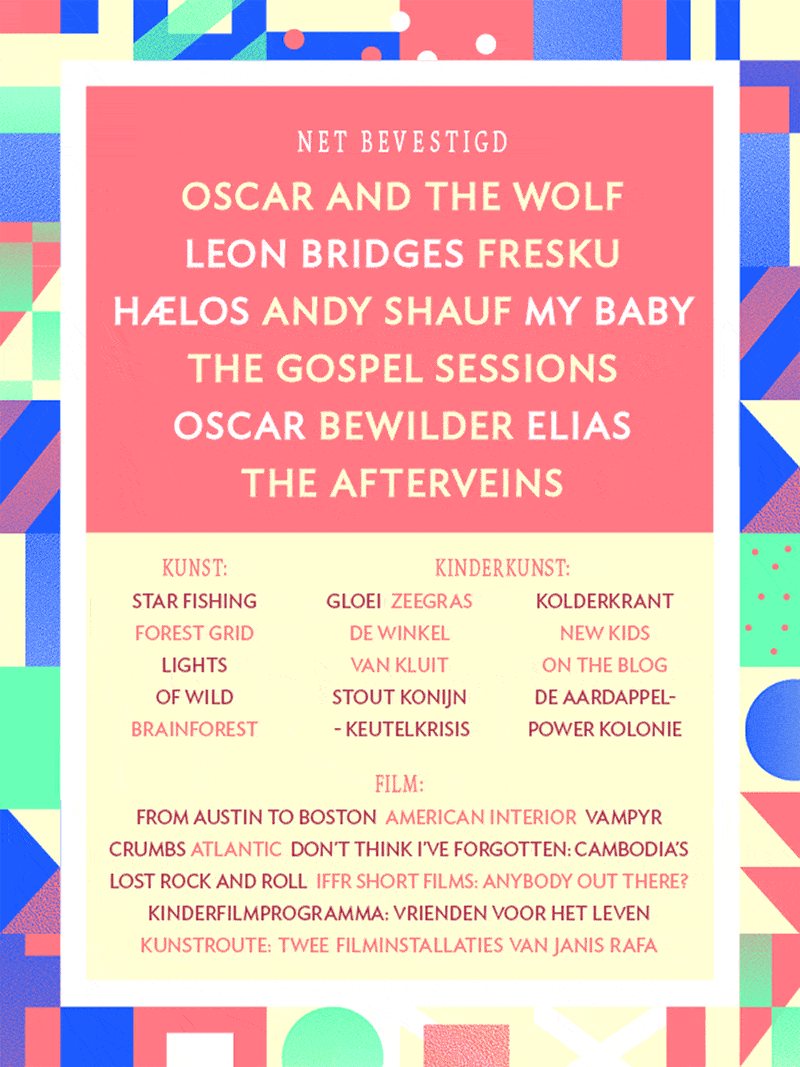
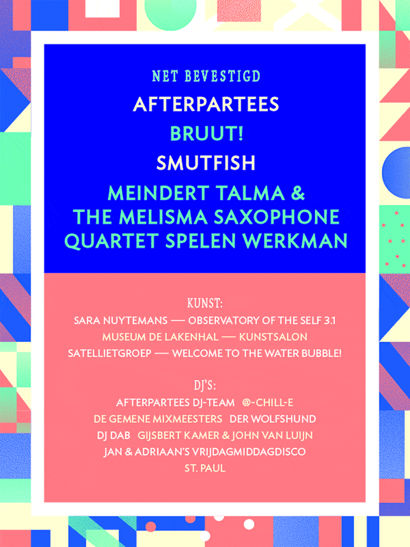
Following the lineup reveal at the end of Here Comes the Summer, a fresh design approach was introduced.
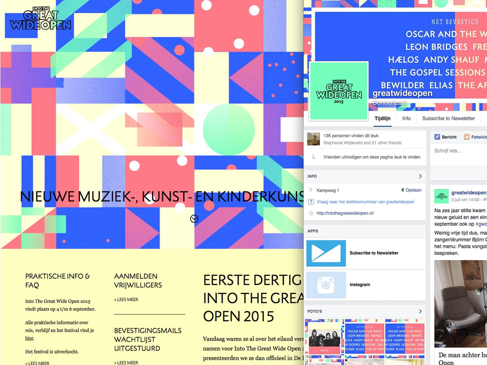

The introduction of the updated lineup and website designs marked the initial stages of the new design direction, swiftly followed by new announcements of artists with 'Just Confirmed' festival updates.
Adapting vibrant web colors to fabric-friendly tones across all mediums necessitated a meticulous transition, especially for festival wristbands and other merchandise items.


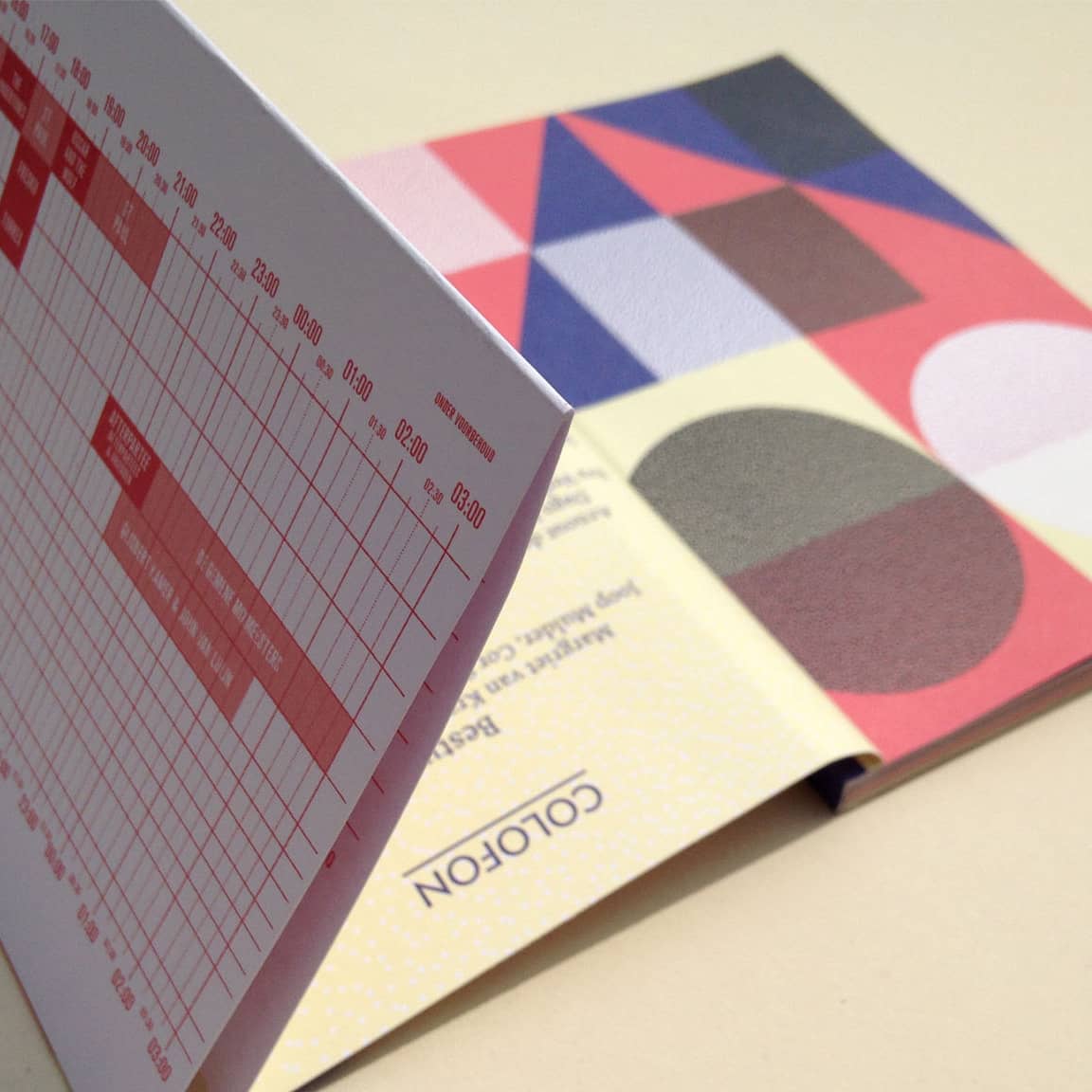

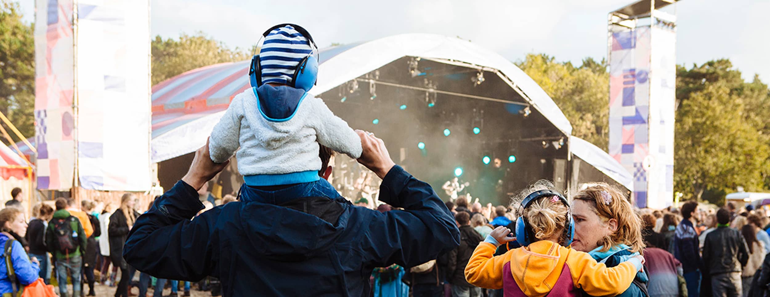
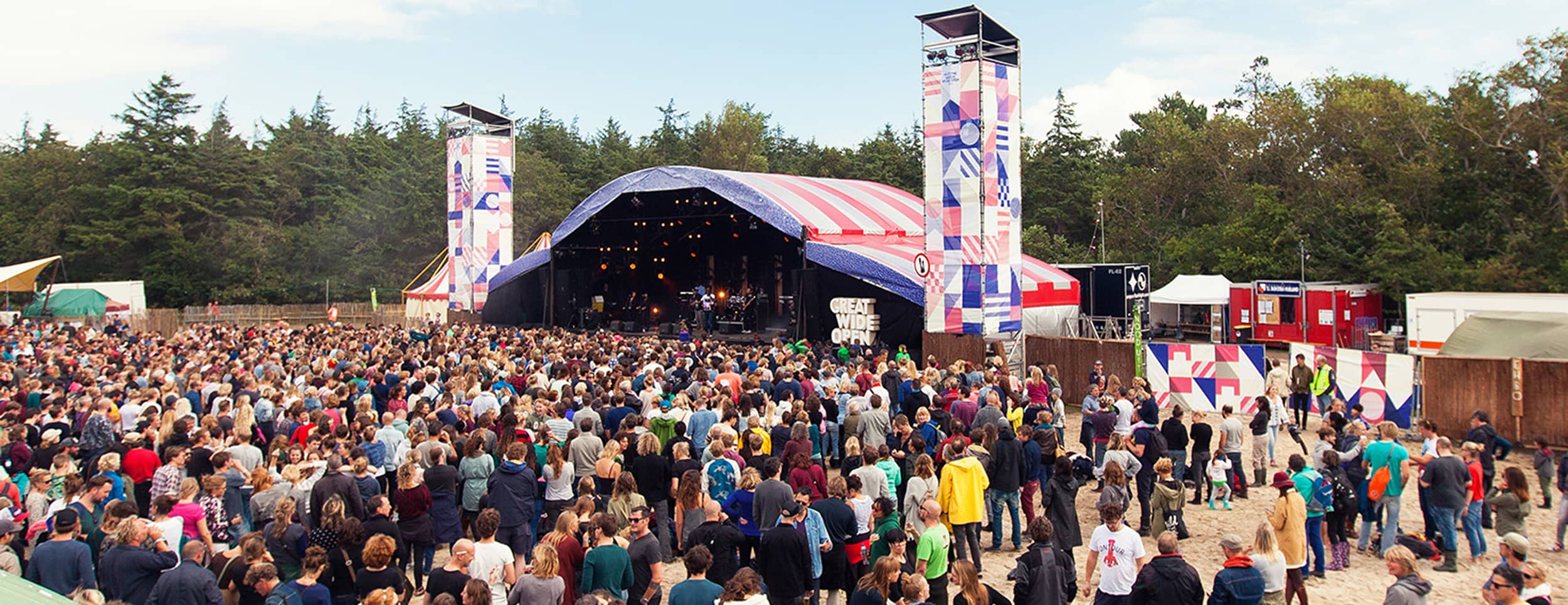
A seamless blend of various elements was essential to create a unique festival atmosphere. Like brothers and sisters, they form one big family, supporting each other in their practical functions and beauty, each contributing to the overall harmony and vibe of the event.