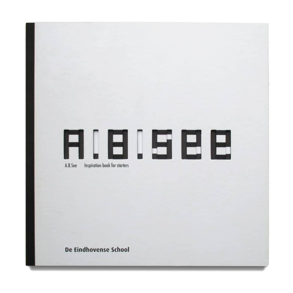
A.B.See
Inspiration book for starters
This book is made for the typographic branche by a group of four students. It is intended as an eye-opener. The possibilities in typography are endless, and you can do so much more with fonts, letters and typefaces.
"You cannot only read them but also use their shapes to create art". A lot of people take letters for granted or they only read them quickly. This book shows you that letters can be beautiful and that they deserve more than just a quick glance.
"You cannot only read them but also use their shapes to create art". A lot of people take letters for granted or they only read them quickly. This book shows you that letters can be beautiful and that they deserve more than just a quick glance.
De Eindhovense School
- Collaboration: Maartje Vermeulen, Luuk Teepen, Laura Wanraij
- Filed: Book, Collaboration, Cover
- Year: 2008

The design of the book cover has been crafted to ensure that the cutout and print on the cover seamlessly harmonize with the print on the initial first page of the interior to showcase the book's title 'A.B.See'.
Produced by Uitgeverij Lecturis, Eindhoven.
Produced by Uitgeverij Lecturis, Eindhoven.